

LinkedIn Banner for Personal Branding: How to Make Your Profile Header Prove What You Do

Most people treat the top of their LinkedIn profile like wallpaper. The stronger move is to treat it like a credibility test: in one glance, a stranger should understand what you do, who you help, and why you are worth a second click.

Search interest around LinkedIn banners, profile backgrounds, and “best background for LinkedIn profile” has climbed because more professionals now understand that the first screen of the profile does a lot of silent work. Before someone reads your About section, scans your experience, or clicks your website, they see your face, your headline, and the strip of space behind it. That space can either say nothing, or it can quietly reinforce your positioning.
This matters even more in the AI era. AI makes it easy to produce polished visuals fast, but it also makes sameness cheap. If your banner looks like a generic template, a fake city skyline, or a random gradient with buzzwords, it does not elevate your personal brand. It makes you look interchangeable.
A better LinkedIn banner does three jobs at once. It clarifies what kind of professional you are. It adds proof or context that supports your headline. And it makes the profile feel intentionally designed rather than accidentally assembled.
When someone lands on your profile, the banner should answer the question they have before they ask it: “What does this person actually want me to understand about them?”
Why Your LinkedIn Banner Carries More Weight Than People Think
The banner is not the most important part of the profile, but it shapes how everything below it gets interpreted. The same headline feels sharper when the banner supports it. The same experience list feels more credible when the top of the page already frames your expertise.
Think of the banner as a positioning amplifier. It should not try to say everything. It should make your core message easier to believe.
For founders, it can signal category, audience, and authority without sounding pitchy.
For consultants, it can clarify the problem you solve and the outcomes you are known for.
For executives, it can support executive presence with restraint, clarity, and seriousness.
For job seekers, it can show direction and proof instead of desperation.
For creators and AI builders, it can make your work legible before people scroll into the details.
The mistake is thinking the banner exists to “look professional.” That bar is too low. The real goal is to make the profile more understandable and more trustworthy.
What a Strong Banner Actually Communicates
A useful LinkedIn banner usually communicates one of four things: what you do, what you are known for, what kind of opportunities you want, or what proof supports your expertise. The best banners often combine two of those, but no more.
1. Your professional lane
If your profile headline says “Founder | Advisor | Speaker,” the banner can make that less vague. Founder of what kind of company? Advisor on what? Speaker about which problem? Clarity beats ambition here.
2. Your audience
The strongest personal brands feel addressed. “I help B2B SaaS founders turn complex products into clear narratives” is more memorable than a banner that simply says “innovation, growth, strategy.”
3. Your proof layer
Proof can be subtle. It might be a short credibility line, a pattern of recognizable outcomes, a visual cue from your body of work, or a simple system diagram that shows how you think.
4. Your style of thinking
Some people win on precision. Others win on energy. Others win on taste. Your banner should echo your professional style, not fight it. A private-equity executive should not use the same visual language as a creator teaching prompt engineering on weekends.
What to Put on a LinkedIn Banner for Personal Branding
If you are unsure what belongs there, use this simple test: does this element make a good stranger understand you faster? If the answer is no, it probably does not belong in the banner.
Keep: one message, one visual direction, one proof cue.
Cut: crowded credentials, motivational filler, fake sophistication, and decoration with no meaning.
Here are strong options:
A concise descriptor of who you help and what outcome you create.
A clean visual tied to your domain: product screens, frameworks, stage photos, diagrams, published work, or a recognizable craft environment.
A restrained proof cue such as “Trusted by SaaS teams,” “Built for healthcare founders,” or “Researching AI workflows for technical teams.”
A subtle brand system: colors, type, and layout that match your website, newsletter, or slide style.
Here is what usually weakens the profile:
Stock skyline imagery that says nothing about your work.
Overloaded service lists that feel like a freelancer marketplace ad.
Buzzword clouds such as “leader, visionary, innovator, growth hacker.”
AI-generated art that looks impressive but has no connection to your actual expertise.
Over-designed personal logos that introduce more confusion than trust.
The Best Banner Strategy by Audience
For founders
Show category clarity and why your perspective matters. A founder banner should help people understand the business context around your name. A simple category statement, clean product-adjacent visual, or point-of-view line is enough. Avoid turning it into a startup ad.
For consultants and freelancers
Lead with the problem solved, not just the role title. “Fractional CMO” is weaker than “Helping B2B teams fix pipeline messaging and demand capture.” If you work across industries, choose the most valuable pattern you are known for.
For executives
Restraint matters. A strong executive banner often uses a muted visual language, a clean credibility line, and a sharper headline rather than loud branding. The feeling should be composed, not sales-driven.
For job seekers
Your banner should show direction, not neediness. Avoid “please hire me” energy. It is better to communicate your target role, domain strength, or body of work than to stack generic “open to work” language everywhere. Let the banner show fit.
For AI builders and technical professionals
Use visuals that point to real work: architecture sketches, code-adjacent diagrams, product system maps, research themes, or shipped outputs. The goal is to show that your expertise is real and applied, not just conceptual.
How to Use AI Without Making the Banner Look Generic
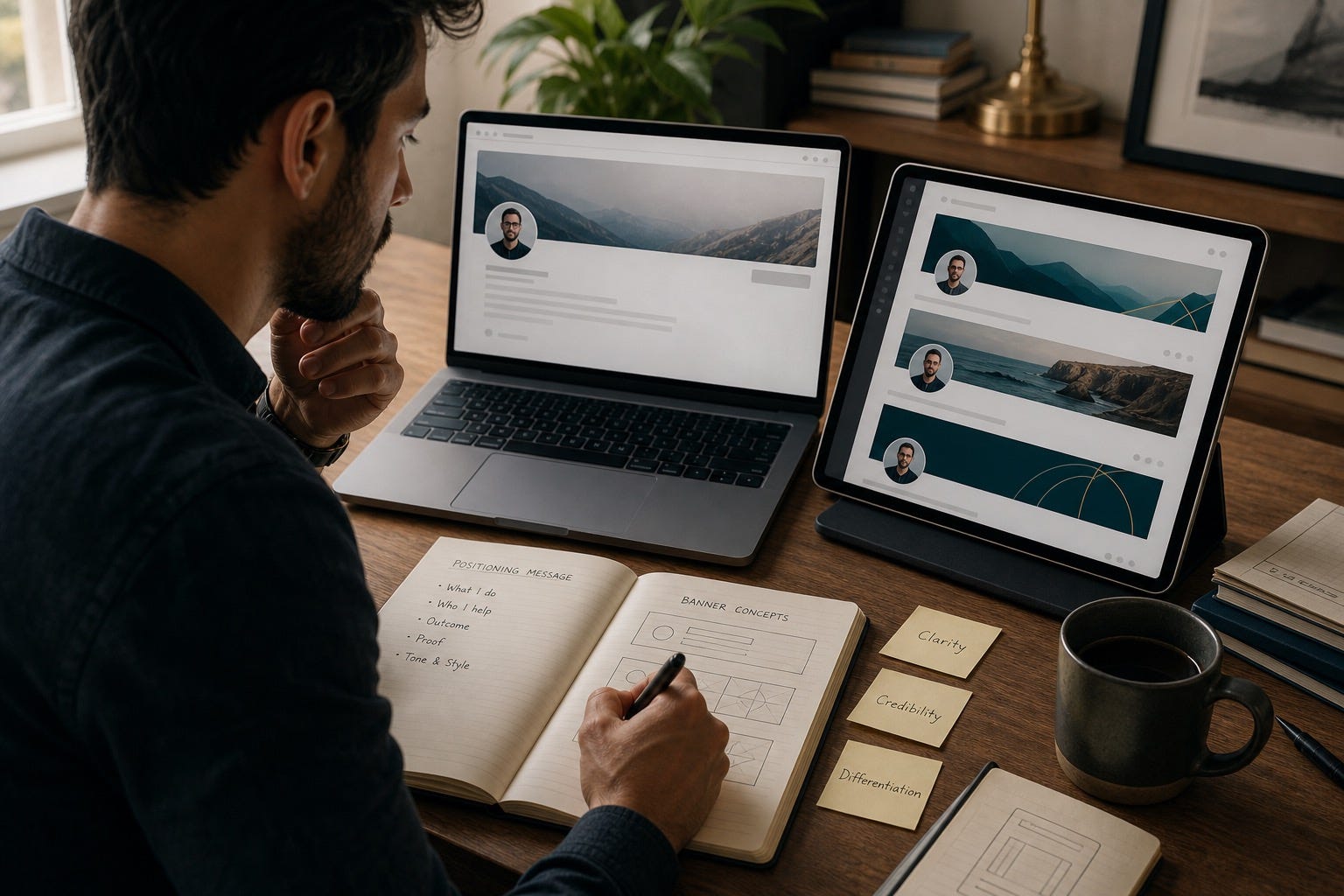
AI is excellent for exploration. It is weak when you ask it to finish the job without supervision. The best workflow is to use AI to generate concepts, then tighten the message yourself.
Here is the practical sequence:
Write the core message first. One sentence is enough: “I help X do Y by Z.”
Choose the proof cue. This could be case-study language, a product visual, a framework, a keyword cluster, or a domain motif.
Ask AI for 5 to 10 visual directions, not final designs.
Pick the direction that feels most specific to your real work.
Edit for restraint. Remove anything that feels too shiny, too busy, or too slogan-heavy.
Test the banner on mobile and desktop. If the message disappears, simplify again.
A useful prompt is not “make me a professional LinkedIn banner.” That gives you generic outputs. A stronger prompt sounds like this:
Create three clean LinkedIn banner concepts for a consultant who helps cybersecurity startups explain technical products to enterprise buyers. Avoid stock business imagery. Use a trust-first visual style, muted palette, subtle diagram elements, and room for a short headline. The result should feel precise, credible, and modern, not flashy.
The same pattern works for students, job seekers, executives, and creators. AI should help you express a point of view you already have. It should not invent one for you.
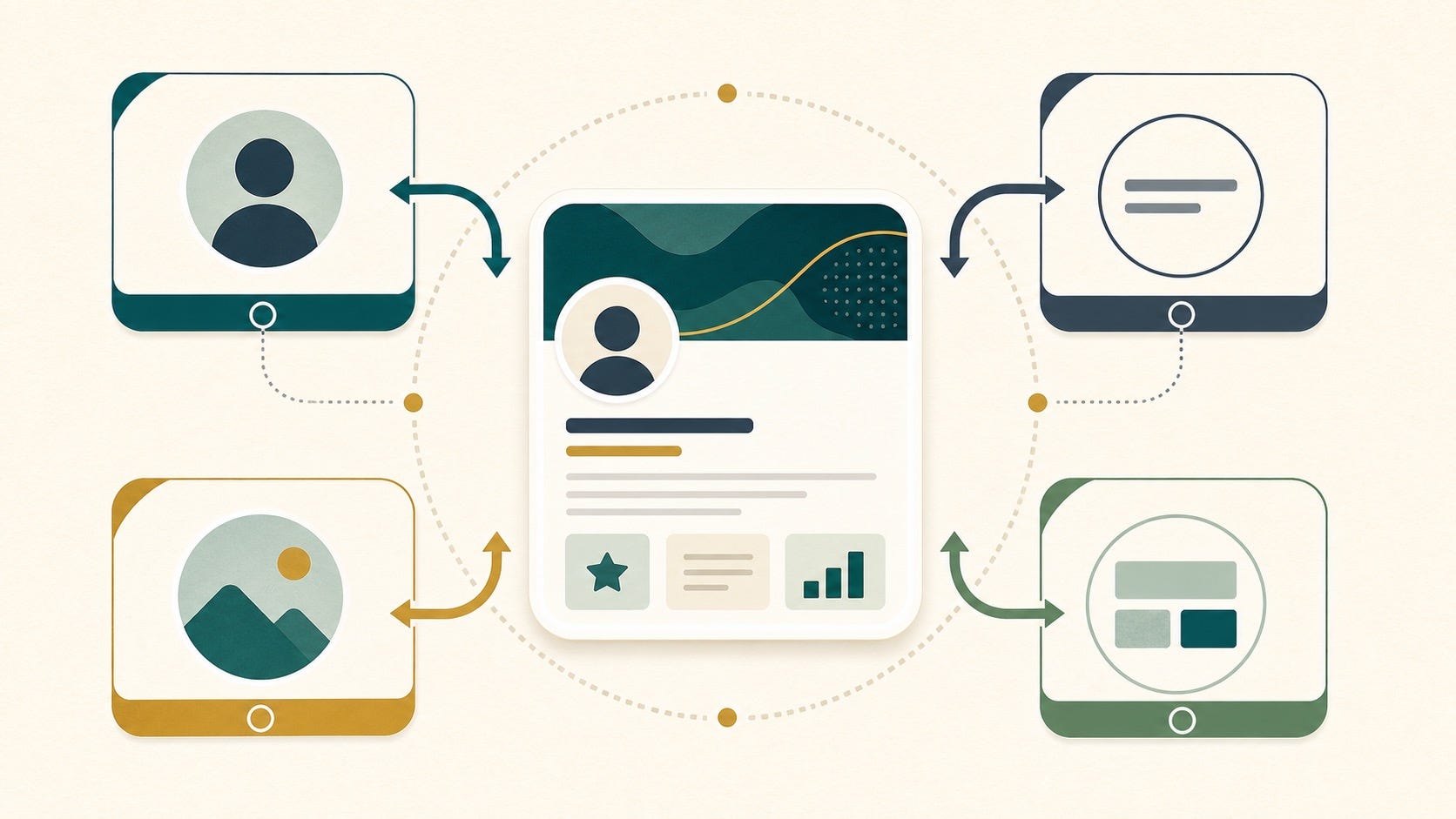
How the Banner Should Connect to the Rest of the Profile
A banner works poorly when it lives alone. It works well when it reinforces the sentence stack at the top of the profile:
Profile photo: says you are real.
Headline: says what you do.
Banner: says how to interpret you.
Featured section: says here is the evidence.
If your headline says one thing and the banner signals something else, the profile feels less trustworthy. If your banner promises expertise but the Featured section contains random links, the effect weakens fast.
This is why the best LinkedIn personal branding systems are coordinated. The banner should create expectation. The headline should sharpen it. The Featured section should confirm it.
A Simple Banner Framework You Can Use Today
If you want a practical formula, use this:
Positioning line: What do you want a new visitor to understand in five seconds?
Audience clue: Who is this for?
Proof cue: What makes it believable?
Visual restraint: What can be removed to make the message sharper?
Example for a founder:
Building workflow software for distributed legal teams
Visual cue: clean interface fragment plus subtle documentation motif
Proof cue: “Used by fast-growing remote firms”
Example for a job seeker:
Data analyst focused on operations, dashboards, and decision support
Visual cue: calm chart language, not a fake corporate skyline
Proof cue: “SQL, Python, BI storytelling”
Example for a consultant:
Helping B2B teams fix confusing messaging before it hurts pipeline
Visual cue: before/after message structure
Proof cue: “Positioning, sales narrative, conversion clarity”
Mistakes That Instantly Make a Banner Weaker
The biggest mistake is trying to make the banner impressive instead of useful. Useful wins. Especially on LinkedIn.
Do not turn it into a miniature homepage.
Do not stack every credential you have ever earned.
Do not use tiny text that disappears on mobile.
Do not let AI add abstract futuristic visuals unless they actually fit your work.
Do not copy creator-style templates if your audience expects executive seriousness.
If you are unsure, simplify. Most LinkedIn banners improve when 30 percent of the elements disappear.
The Real Goal: Make the Profile Easier to Trust
Personal branding is not just visibility. It is interpretation. People do not simply see your profile. They make assumptions from it. A strong LinkedIn banner helps guide those assumptions in your favor.
That is why this small strip of visual space matters. It can make your profile feel sharper, more coherent, and more intentional before anyone reads a full paragraph. In a feed full of AI-generated sameness, that is not cosmetic. It is strategic.
If you use AI, use it like a strong assistant: ask it for options, then apply your own taste, proof, and judgment. The professionals who win with AI personal branding are not the ones who automate identity. They are the ones who make their real expertise easier to recognize.
FAQ
What should I put on a LinkedIn banner for personal branding?
Include one clear message about what you do, who you help, or what you are known for. Add a subtle proof cue or relevant visual context, but avoid clutter, buzzwords, and decorative filler.
Does a LinkedIn banner really matter for personal branding?
Yes, because it shapes first impressions before someone reads the rest of your profile. It will not create credibility on its own, but it can make your positioning easier to understand and your expertise easier to trust.
Can I use AI to create a professional LinkedIn banner?
Yes, but use AI for concept generation rather than blind final output. Start with a specific message, ask for several visual directions, then edit the result so it reflects your actual work and does not look like a generic template.
What is the best background for a LinkedIn profile?
The best background is one that supports your professional identity without distracting from your face and headline. Clean visuals tied to your field usually work better than stock skylines, loud patterns, or unrelated abstract art.
Should job seekers use a LinkedIn banner?
Yes. A job seeker banner can show target role, domain focus, and proof of skill in a more specific way than generic “open to work” messaging. It should communicate direction and capability, not desperation.
How often should I update my LinkedIn banner?
Update it when your positioning changes, your target audience shifts, or your proof assets improve. For most people, a quarterly or milestone-based refresh is enough. Constant changes usually signal uncertainty rather than momentum.