

LinkedIn Custom Button for Personal Branding: How to Turn Profile Views Into Trust in 2026
Personal branding · AI workflows · Founder visibility

LinkedIn’s new premium CTA features can help founders, consultants, and experts capture more intent, but only if the click leads to proof, clarity, and the right next step.

Most people will use LinkedIn’s new custom button the wrong way.
They will treat it like free ad space, send profile visitors to a generic homepage, and then wonder why more profile traffic does not turn into better conversations.
The better move is to treat the button like a trust filter.
That is what makes this feature interesting for personal branding in 2026. LinkedIn is no longer just a public resume. It is becoming a routing layer for reputation, proof of work, and commercial intent. If someone lands on your profile after hearing you on a podcast, seeing your post, or finding you in search, the button tells them what kind of relationship you want next.
Done badly, it feels needy. Done well, it feels clear.
This guide is for founders, consultants, fractional leaders, creators with services, and senior professionals who want to use the LinkedIn custom button for personal branding without making their profile feel like a landing page in disguise.
Why this matters right now
LinkedIn’s Premium Business rollout gave solo professionals and founder-led brands a more direct way to turn profile attention into off-platform action. The new tools are not just cosmetic. LinkedIn is positioning them as visibility and conversion features, including a custom button, dynamic cover image support, lead insights, and AI profile help. Public reporting on the May 12, 2026 launch also highlighted early gains in profile views, followers, and website visits for some early users.
That matters because personal branding has a distribution problem. More people can see you, but very few know what to do next. Your content may create demand, but your profile still has to convert that demand into a useful next step.
If you are a founder, the next step might be a waitlist, a founder letter, or a product narrative page. If you are a consultant, it might be a service explainer, case study hub, or booking page. If you are a senior operator, it might be a speaking page, a thought leadership archive, or a compact personal site that proves your point of view.
The custom button compresses that decision into one visible signal. That is why it deserves more strategic thought than most people will give it.
The button is not the strategy. It is the handoff between attention and trust.
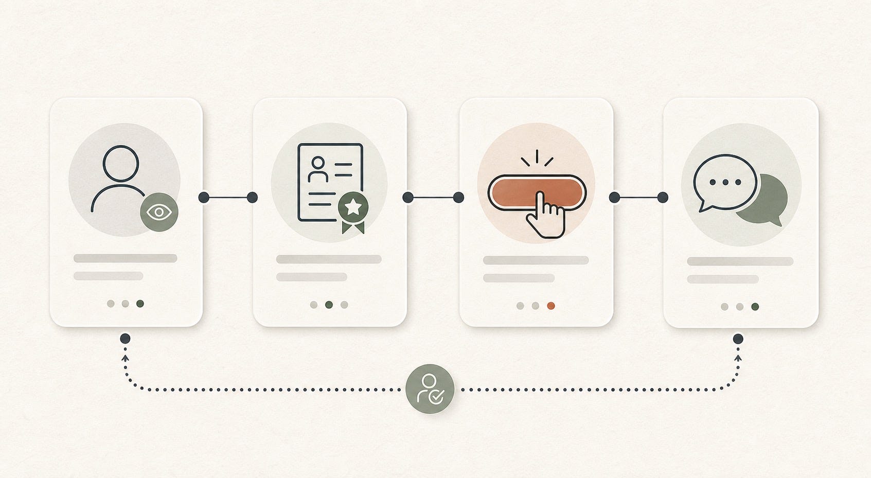
What the LinkedIn custom button actually changes
The practical change is simple: visitors no longer have to hunt through your featured section, about block, or contact info to find the next step. They can act immediately. LinkedIn also places that CTA in higher-attention surfaces than a buried link usually gets.
But the deeper change is psychological. A visible CTA forces you to answer one uncomfortable personal-branding question:
What do I actually want this profile to do?
Many professionals never answer that clearly. Their profile tries to do six jobs at once:
Attract recruiters
Sell consulting
Grow an audience
Book speaking
Support fundraising
Signal expertise to peers
The custom button makes that confusion more expensive. When the CTA is vague or mismatched, visitors feel friction immediately.
Choose the destination before you choose the CTA label
Most people start with the wording: Book now, Visit website, Learn more. That is backward.
Start with the destination. Ask: if the right person clicks from my LinkedIn profile, what page would make them trust me faster?
Best destinations for different personal brand goals
Founders: a founder letter, product story page, or proof-heavy company page that explains the problem, the wedge, and why you care.
Consultants and fractional leaders: a compact services page with outcomes, who you help, case studies, and a low-friction contact option.
Creators and educators: a newsletter landing page, resource library, or topic hub that shows what your audience will keep learning from you.
Executives and operators: a speaking page, bio page, or curated archive of writing, interviews, and notable wins.
Job seekers with a strong point of view: a clean portfolio or expertise page with proof, not a generic all-purpose homepage.
The wrong destination is usually your homepage. Homepages are designed to serve many audiences. A profile CTA works best when it serves one intent well.

Build trust before the click
A button works only if the rest of the profile earns it. Before you worry about the CTA, make sure these trust signals are in place:
A clear headline. Not a slogan. A reader should know who you help, what problem you work on, and what lens you bring.
A sharp about section. This is where you prove judgment, not where you paste every title you have held.
Featured proof. Link to outcomes, essays, interviews, frameworks, case studies, or demos that back up the claim in your headline.
Visual consistency. Your headshot, banner, featured assets, and destination page should feel like the same person and the same standard.
Audience fit. The profile should make it obvious who should reach out and who should not.
This is where many AI-assisted personal brands fail. AI helps them publish more, but it does not force message consistency. The result is a profile with motion but no center.
The best CTA is usually lower-pressure than you think
If your audience is high trust and high intent, then yes, a booking link may work. But most personal brands are not dealing with warm buyers all day. They are dealing with curious, semi-qualified profile visitors.
That is why the best CTA often feels one step softer than your revenue goal.
Instead of Book a call, use a page that explains how you work before asking for time.
Instead of Hire me, route to a focused service page or case study hub.
Instead of Visit website, route to the single page most likely to make your expertise believable.
Think of the CTA as a promise. The click should fulfill what the profile implied. If your profile says you are a calm, senior strategic operator, do not send the click to a cluttered page full of popups, vague claims, and twelve offers.
An AI workflow for finding the right CTA angle
This is a good use case for AI because the job is comparative, not purely creative. You are testing clarity, alignment, and trust language across a few options.
Here is a practical workflow:
Export or paste your current LinkedIn headline, about section, featured links, and intended destination page into your AI tool of choice.
Ask the model to identify the single strongest audience promise in your profile.
Ask it to generate three CTA paths based on different visitor intents: curious, warm, and ready-to-talk.
Have it score each path for clarity, trust, and expectation match.
Rewrite only the weak parts yourself so the final language still sounds like you.
A useful prompt looks like this:
Review my LinkedIn headline, about section, featured links, and target page. Tell me what action a high-fit visitor would most naturally want to take next. Give me three CTA options and explain which one creates the strongest trust match for a founder, consultant, or operator audience.
The key rule is simple: use AI to compare options, not to invent a fake persona. If the copy becomes smoother but less specific, you are moving backward.
What good CTA alignment looks like
Imagine a B2B founder who posts sharp opinions on category design and product positioning. Their profile headline is specific, their featured section includes a strong essay and a customer case study, and the custom button routes to a short founder letter plus product overview. That click feels coherent.
Now compare that with a consultant whose profile talks about helping SaaS teams fix churn, but whose button goes to a generic homepage with no proof, no point of view, and no clear next step. Same feature. Completely different trust outcome.
The LinkedIn custom button for personal branding works best when the path feels continuous:
Post creates interest
Profile sharpens authority
Button clarifies the next step
Destination page converts curiosity into confidence
Five mistakes that make the button hurt your brand
Sending traffic to your homepage. Too broad. Too many exits. Not enough proof for the specific intent that brought the visitor there.
Using the hardest ask too early. A cold profile visitor usually is not ready for a direct sales call.
Over-branding the profile. If the page starts looking like a company brochure, your personal authority gets buried.
Letting AI flatten your message. Safe, polished copy can quietly erase the reason people remember you.
Ignoring the page after the click. The destination is part of your LinkedIn profile now, whether you think of it that way or not.
A seven-day implementation plan
If you want to fix this fast, use a one-week sprint:
Day 1: Audit your current profile for message clarity, proof, and audience fit.
Day 2: Pick the one audience and one action that matter most in the next 90 days.
Day 3: Choose the destination page that best supports that action.
Day 4: Use AI to test three CTA angles and rewrite the winner in your own voice.
Day 5: Tighten headline, about section, and featured links so they lead naturally into the CTA.
Day 6: Review the destination page on mobile and cut any clutter, weak claims, or mixed messages.
Day 7: Publish, then watch what kind of conversations the button produces, not just how many clicks it gets.
The final point matters most. A stronger personal brand does not just create more activity. It creates better-fit activity.
The bigger lesson
The interesting thing about the LinkedIn custom button is not the button itself. It is what the feature reveals. Modern personal branding is less about being visible everywhere and more about reducing confusion at the moments that matter.
Visibility gets you the profile view. Credibility gets you the click. Relevance gets you the conversation.
If you design the button as part of that system, it can become one of the cleanest trust upgrades on your profile this year.
If you treat it like a shortcut, it will behave like one.
FAQ
What is the best LinkedIn custom button for personal branding?
The best button is the one that matches your highest-value audience and the most trust-building next step. For most founders, consultants, and executives, that means a proof-heavy destination page rather than a generic homepage.
Should I send my LinkedIn custom button to my homepage?
Usually no. Homepages are often too broad. A focused founder page, service page, resource hub, or speaking page usually converts profile intent better because it matches the reason someone clicked.
Is LinkedIn Premium Business worth it for founders and consultants?
It can be worth it if your profile already attracts relevant attention and you have a strong destination page behind the CTA. If your message, proof, and positioning are still weak, paying for the feature will not fix the underlying brand problem.
How can AI help improve my LinkedIn CTA strategy?
AI is useful for comparing CTA options, summarizing the promise your profile currently makes, and spotting mismatches between your profile and your landing page. It is less useful when you let it invent generic personal-brand copy that sounds polished but vague.
What should consultants link to from a LinkedIn custom button?
Consultants should usually link to a page with a clear problem statement, who they help, outcomes, short case studies, and an easy next step. The goal is to make the visitor feel oriented, not overwhelmed.
Can a custom CTA make a personal profile feel too salesy?
Yes, if the CTA is too aggressive or the destination page feels like a funnel. The fix is to lower pressure, increase proof, and keep the message aligned with the tone of your profile.