


Most LinkedIn banners are decorative. A good slideshow banner does a harder job: it helps the right person understand who you help, why you are credible, and what they should do next before they even read your About section.
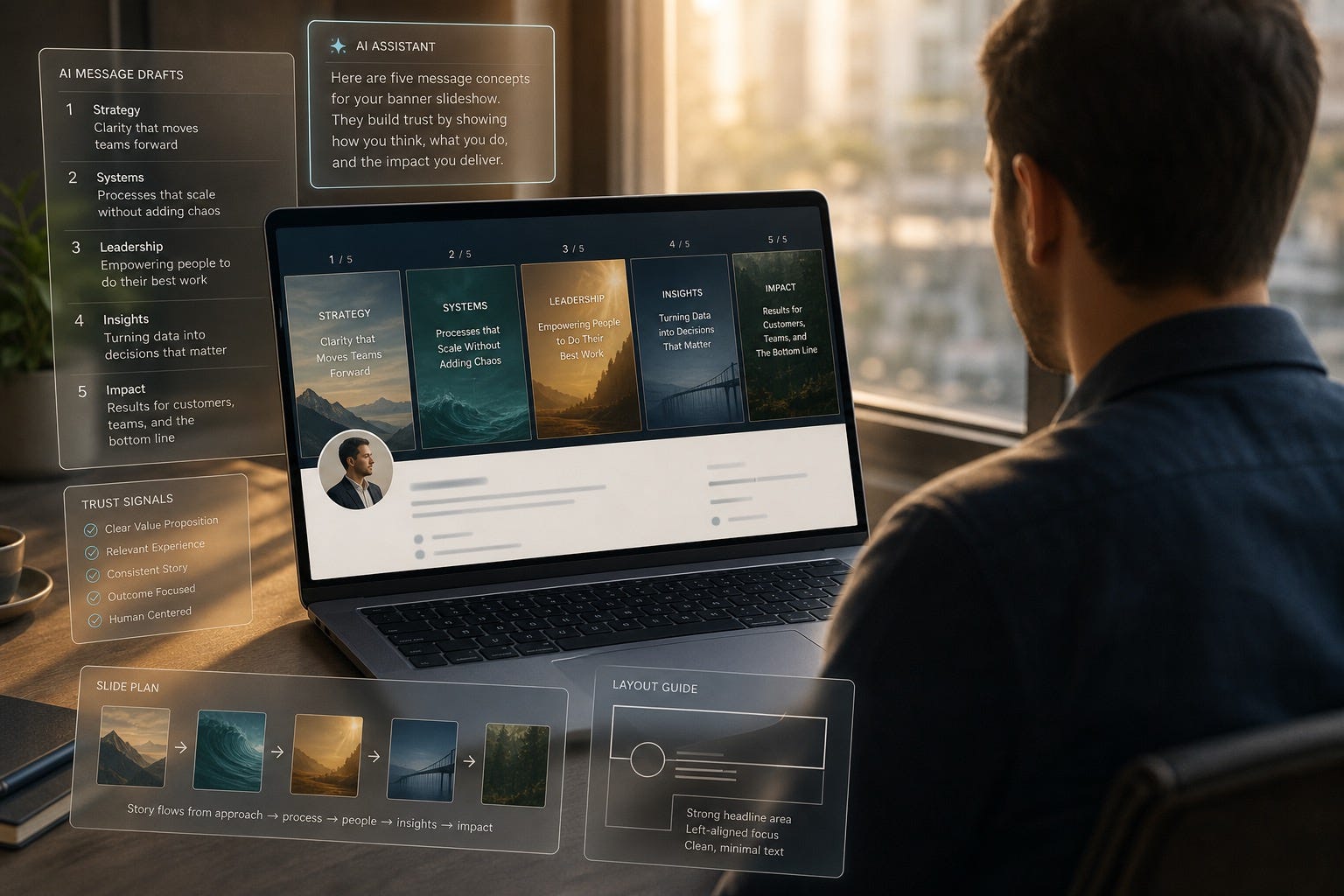
LinkedIn keeps adding more ways for professionals to get discovered, compared, and judged fast. That matters because profile visits now happen in more contexts than “someone clicked your name.” People find you through comments, search, recommendations, newsletter posts, founder research, and quiet referral checks.
That makes your top-of-profile real estate more important than ever. As of July 10, 2026, LinkedIn Help says free members can upload a single cover image, while slideshow cover images are a Premium feature and can include up to five images. Most advice about the feature stops at “upload a few slides.” That is shallow advice. The real question is what each slide should do for trust.
If you use AI well, this feature becomes more than a design trick. It becomes a compact personal branding system. AI can help you decide what proof to show, how to sequence it, how to write shorter copy, and how to keep every slide aligned with your positioning. What AI should not do is turn your profile into a generic carousel of slogans.
The banner is not there to impress everyone. It is there to reduce uncertainty for the right viewer.
This article shows you how to do that. You will get a five-slide framework, AI prompts, design rules, and a decision filter for when a slideshow banner helps your brand and when it hurts it.
Why This Feature Matters for Personal Branding
Most professionals still think of a LinkedIn banner as background decoration. That is a mistake. Your banner sits above your headline, above your Featured section, and above almost every proof asset you worked so hard to create. It frames the rest of your profile.
A slideshow banner matters because it lets you answer several questions in sequence without cramming everything into one image:
Who are you for?
What do you want to be known for?
What proof makes that claim believable?
What kind of opportunities are relevant to you now?
What should the viewer do next?
That makes this especially useful for founders, consultants, executives, job seekers, creators, and AI builders whose work spans more than one format. A static banner can show one message. A slideshow can show a mini trust stack.
The gap in most existing advice is strategic. You can find plenty of posts about dimensions and design tools. There is far less guidance on message architecture, narrative order, and how to avoid making the slideshow feel like a low-budget ad.
Choose One Job for the Slideshow
Before you open Canva, Figma, or an image generator, decide what job the banner needs to do. If you skip this step, you will end up mixing audiences and weakening the profile.
Pick one primary job:
Founder visibility: clarify the company problem you solve and show why people should trust the operator behind it.
Consultant credibility: show niche, method, and selective proof without turning the profile into a brochure.
Executive presence: reinforce authority, calm, and clear judgment rather than “look how busy I am” energy.
Job search differentiation: make hiring managers understand your specialty fast without shouting “open to work” in every frame.
Creator authority: connect point of view, body of work, and audience fit.
If your slideshow tries to sell services, attract podcast invites, recruit talent, land a job, and promote a newsletter all at once, it will do none of them well. Personal branding gets stronger when the viewer feels one clear signal, not six competing ones.
The Five-Slide Trust Sequence
Here is the simplest structure I have found that works across most professional categories. Think of it as a progression from identity to evidence.
Slide 1: Clear Positioning
This slide answers: who do you help and what do you help them do? Keep it shorter than your instincts want. Short copy feels more credible at banner speed. Good slide-one text sounds like a precise promise, not a motivational quote.
Slide 2: Specific Proof
Now show evidence. This can be a result, role, client type, speaking credential, shipped product, publication, or recognizably hard problem you solved. Proof beats personality theater. If you have a metric, use one. If you do not, use a concrete artifact.
Slide 3: Method or Perspective
What is different about how you think or work? This is where founders can show their operating philosophy, consultants can show their framework, and executives can show how they lead through ambiguity. This slide creates memorability.
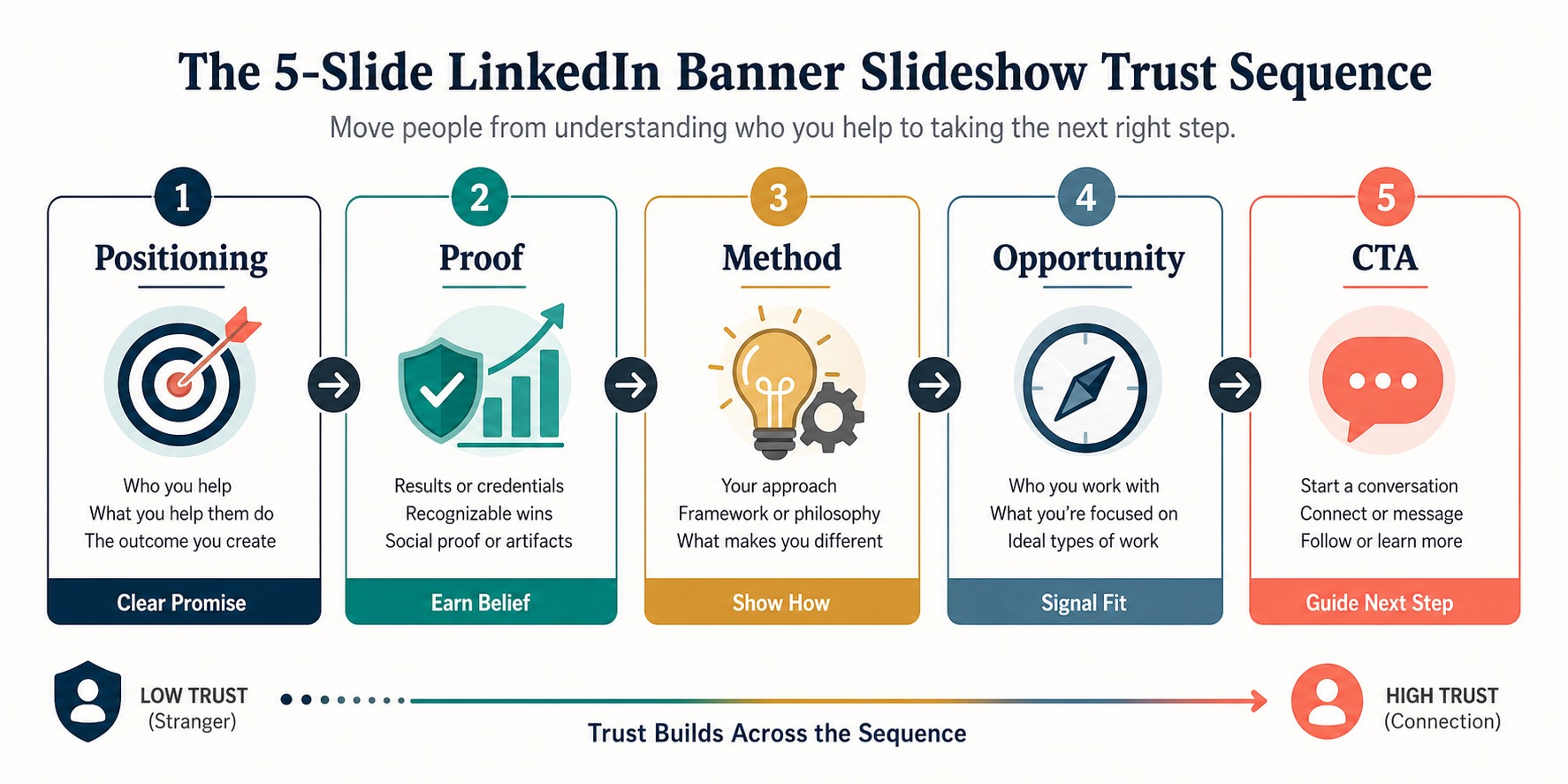
Slide 4: Opportunity Signal
Tell the viewer what kind of conversations make sense now. Examples: advisory work, speaking, fractional leadership, senior product roles, select consulting engagements, partnerships, or recruiting conversations. This filters inbound attention.
Slide 5: Light CTA
Do not end with “Book now” unless you want to look like a landing page. A better CTA is lighter and more relational: connect, follow, message, read, or ask. Personal branding works best when the CTA feels like a professional next step, not a hard close.
This sequence works because it mirrors how trust forms online: claim, evidence, interpretation, relevance, action.
How to Use AI Without Making the Banner Feel Synthetic
AI should help compress your message, not replace your judgment. The fastest workflow is to feed AI the raw material it cannot invent well on its own: your outcomes, your niche, your strongest examples, your common client or employer questions, and the opportunities you want.
Use this prompt structure:
I need a five-slide LinkedIn profile banner slideshow for personal branding. My audience is [audience]. I want to be known for [specialty]. My strongest proof is [proof]. My tone should feel [tone]. Generate five short slide messages with one job per slide: positioning, proof, method, opportunity signal, soft CTA. Keep each slide under 12 words. Avoid hype, vague claims, and generic AI language.
Then ask AI to generate three variants:
A conservative version for executives and consultants
A sharper version for founders and creators
A warmer version for job seekers and community-led professionals
After that, do the most important step yourself: edit for realness. Replace generic verbs like “empower,” “transform,” and “elevate.” Add actual nouns from your work. Name the buyer, user, team, industry, or problem. AI usually fails at professional gravity because it speaks in category cliches instead of lived specifics.
You can also use AI for visual planning. Ask it to create a simple slide brief with color palette, icon ideas, and a safe-zone layout so your text survives desktop and mobile cropping. That will save time if you work with a designer or build the slides yourself.
Design Rules That Make the Slideshow Look Credible
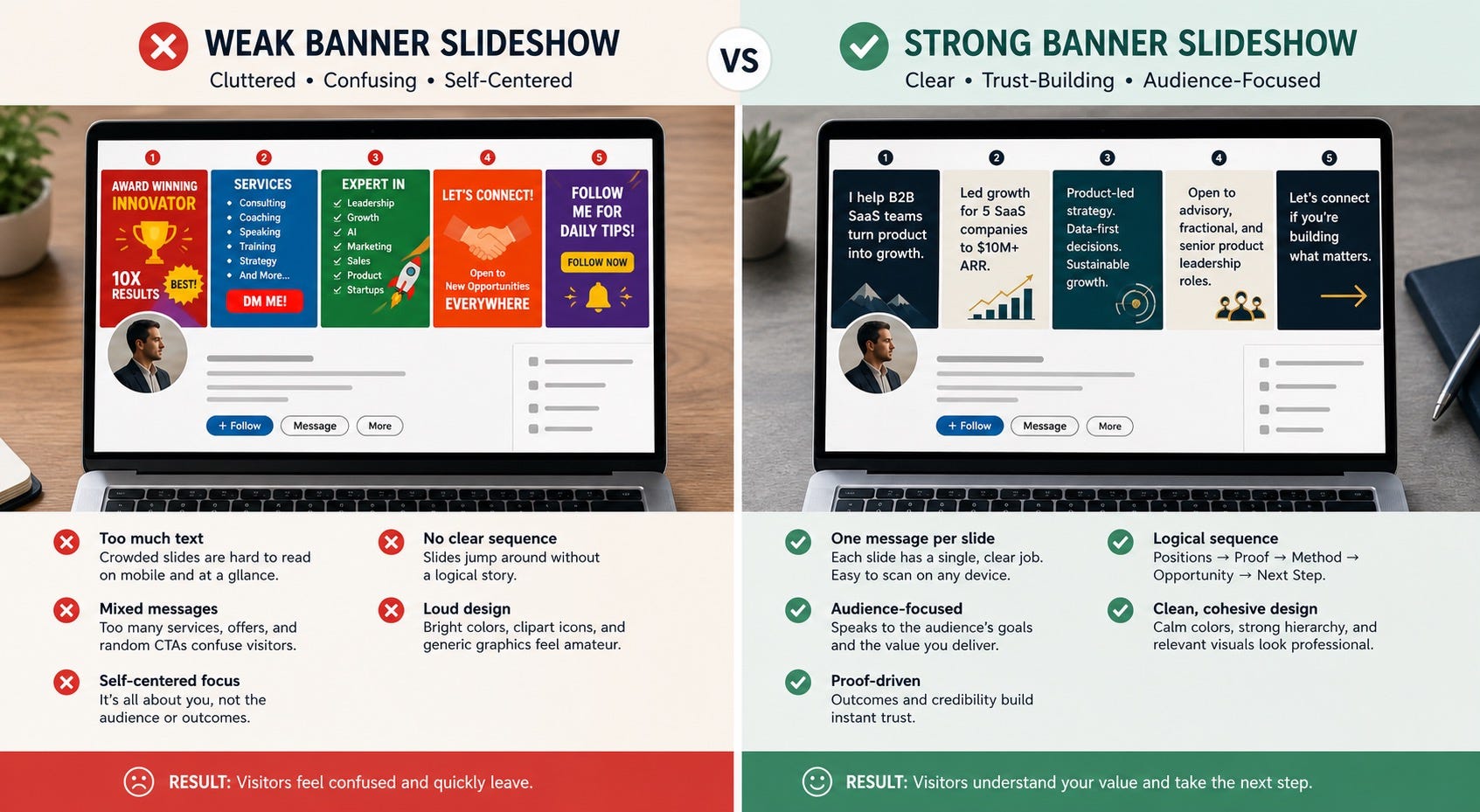
A slideshow banner becomes weak when it tries to behave like a presentation deck. Remember where it lives. People see it behind your headshot, beside your headline, on different screens, and often for only a moment.
Use these rules:
Keep one idea per slide. If you need two sentences, the slide is overcrowded.
Design for mobile first. If the message fails on a phone, it fails.
Leave generous space on the left and lower areas where LinkedIn overlays profile elements.
Use one visual system across all five slides so the sequence feels intentional.
Prefer one short line of text plus one proof cue, not paragraphs.
Use real brand colors only if they already fit your professional identity. Forced “branding” often looks cheaper than neutral design.
Do not put your entire resume in the banner.
If you want a useful technical baseline, many current guides recommend designing profile banners at 1584 by 396 pixels. More important than the exact size is the safe-zone discipline. Your essential words should remain readable even when LinkedIn crops or overlays them differently across devices.
Examples by Audience
Here is how the same framework changes by role.
For founders
Lead with the problem your company is known for, not your title. Then show a signal like user growth, category insight, product screenshots, or a short testimonial fragment. Founders earn trust faster when they look like operators, not lifestyle creators.
For consultants and fractional leaders
Use the slideshow to make your specialty obvious. Most consultants lose profile conversions because visitors cannot tell whether they do messaging, GTM, ops, leadership coaching, or all of the above. Narrowness reads as credibility.
For job seekers
Do not make every slide about being available. Show the kind of work you do best, one concrete proof point, and the environment where you add value. Hiring managers want fit and evidence before they want enthusiasm.
For creators and experts
Use one slide for your point of view, one for proof of audience or output, one for media or speaking signals, one for the topics you cover, and one for the next step. Avoid turning every slide into self-praise.
When You Should Not Use a Slideshow Banner
This feature is not automatically better than a single strong banner. Skip the slideshow if:
Your positioning is still changing every month
You do not yet have enough proof to justify five frames
Your audience values restraint and simplicity over visual storytelling
Your profile already feels crowded with too many offers and calls to action
You cannot maintain visual quality across all slides
A static banner is often the better choice for senior operators, researchers, and technical experts with a narrow value proposition. The rule is simple: more visual space should create more clarity, not more noise.
A Practical 30-Minute Build Process
Write one sentence describing the exact audience you want your profile to attract.
List three proof points that a skeptical stranger would actually believe.
Use AI to generate five short slide messages from those inputs.
Cut every line until it feels slightly too short.
Choose one layout system and repeat it across all five slides.
Preview the slides on desktop and mobile before publishing.
Ask one trusted peer: “What do you think I do after seeing only the banner?”
If their answer is fuzzy, simplify and republish.
That last step matters more than any design tool. Personal branding is not about self-expression alone. It is about interpreted clarity.
Final Thought
People do not trust you because your profile looks busy. They trust you because your profile helps them understand something quickly and believe it. A LinkedIn profile banner slideshow can do that if each frame earns its place.
Use AI to speed up the writing, sequencing, and visual planning. Keep human judgment in charge of what proof belongs on the page. The goal is not a prettier header. The goal is a profile that feels more legible, more credible, and more useful to the right people.
FAQ
What is a LinkedIn profile banner slideshow?
It is a LinkedIn profile cover feature that lets eligible Premium users upload up to five rotating banner images instead of using one static cover image.
Who should use a LinkedIn banner slideshow for personal branding?
It works best for founders, consultants, executives, creators, and job seekers who need to communicate more than one trust signal without overcrowding a single image.
What should I put on each LinkedIn banner slide?
A strong sequence usually includes positioning, proof, method, opportunity signal, and a soft call to action. Each slide should have one clear job.
Can AI help me create a LinkedIn banner slideshow?
Yes. AI is useful for drafting short copy, generating alternative slide sequences, clarifying tone, and creating visual briefs. It should not invent your proof or replace your final editing.
Is a slideshow better than a static LinkedIn banner?
Not always. A slideshow is better when the extra frames add clarity. If your positioning is simple and your proof is already obvious, one strong static banner may work better.
How much text should a LinkedIn banner slide contain?
Less than most people think. Aim for one short line or phrase that stays readable at a glance on mobile. If the viewer needs to pause and decode it, the slide is too busy.
What is the biggest mistake people make with LinkedIn banner slideshows?
The biggest mistake is treating the slideshow like a mini presentation. Too many slides repeat generic slogans, cram in too much copy, or mix several audiences at once.